Charts Overview
2 min read
Charts are the visual building blocks of Observatory. Each chart focuses on one metric, trend, or distribution and lives inside a panel.
Use charts to answer questions such as:
- Which priority areas still depend on manual testing?
- Which executions carry the most failed or blocked test cases?
- Which requirements have the most linked defects?
- Which defect severity bands are still open?
Ways To Add Charts
Section titled “Ways To Add Charts”Select Add Insight inside a panel to open the window with three tabs: Smart Insights, Collections, and Custom Builder.
Smart Insights
Section titled “Smart Insights”Smart Insights are ready-made analytical questions grouped by category, with recommendations based on your project’s health. You choose a question and Hawzu builds the chart. See Smart Insights.
When a Smart Insight has already been added to the current panel, it appears as Added and cannot be added again from the same picker.
Collections
Section titled “Collections”Collections are curated, role-based sets of insights added to a panel in one click. See Collections.
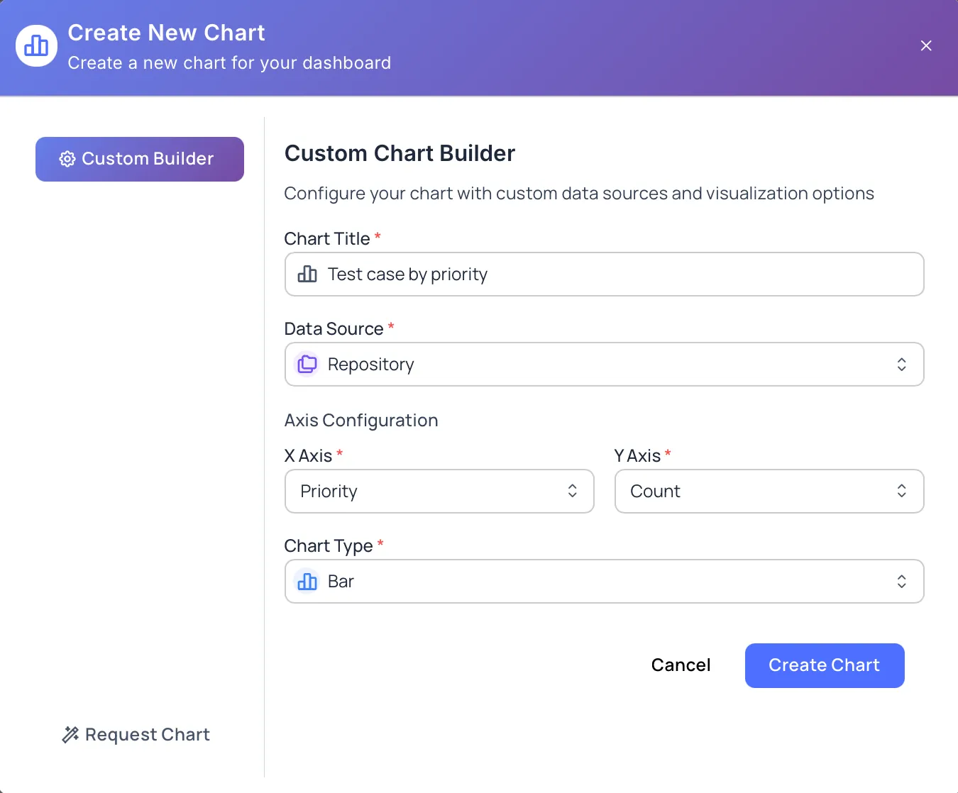
Custom Builder
Section titled “Custom Builder”Custom Builder lets you create a chart by choosing:
- Chart Title
- Data Source
- X Axis
- Y Axis
- Chart Type
The Create Chart button is available after the required fields are selected.
Request Chart
Section titled “Request Chart”Use Request Chart when the chart you need is not available yet. Describe the chart request in the Chart Description field.
The description must be at least 50 characters before the request can be submitted.
Chart Types
Section titled “Chart Types”Available chart types depend on the selected data source and fields.
Observatory supports:
- Bar
- Line
- Pie
- Doughnut
- Stacked Bar
- Area
- Polar Area
- Radar
- Scatter
- Bubble
- Bar + Line (a combined chart)
Use bar or stacked bar charts for comparisons, line or area charts for trends, pie, doughnut, or polar area charts for simple distributions, radar for multi-field comparison, and scatter or bubble charts to relate two measures. Some curated trend insights use specialized time-series charts — for example, automation over time, defect status trend, reopened defects over time, and test suite growth. The chart types offered for a given chart depend on the data source and the X and Y selection.
Chart Actions
Section titled “Chart Actions”Charts include actions to help you review and adjust the visualization:
- Insights appear on charts that include supporting observations
- Filters narrow the chart to a date range (last 7, 30, or 90 days, all time, or a custom range) and, where available, to specific executions
- Refresh chart data updates the chart with the latest project data
- Fullscreen gives the chart more room for review
- Settings lets you rename the chart and change its chart type (the data source and axes are fixed once the chart is created)
- Delete Chart permanently removes the chart from the panel
Next Steps
Section titled “Next Steps”- Add ready-made insights with Smart Insights
- Create charts with Create Charts
- Manage chart actions with Manage Charts
- Review supported fields in Chart Data Sources
- Organize charts using Organizing Panels